How the lack of colour in landscapes can change people’s perspective?
The theme within colour that I have chosen to investigate is how manipulating colour within a photographic landscape can change the way people perceive the photograph. Throughout this essay I will be using perspective as a means of expressing the particular attitude a person has towards regarding something; a point of view. I will specifically explore how the use of or lack of colour can change the mood and emotion of the viewer and how certain moods and atmospheres can be expressed through colour and the photographic landscape.
Colour within the photographic image has always played a major role in telling a story, whether it’s the sticking use of black and white or intense use of saturated colour it continues to be one of the most important tools in the photographers control that allow him or her to impact the viewer in a very personal way.
There are four psychological primary colours - red, blue, yellow and green. They relate respectively to the body, the mind, the emotions and the essential balance between these three.
| photography_essay_-_roisin.docx |
Initial Contact Sheets
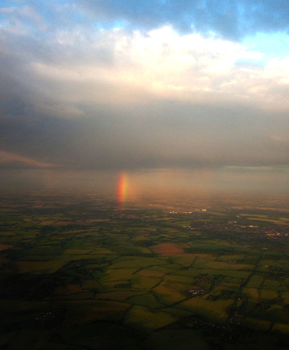
This is a birds eye view image of the countryside in which a rainbow has appeared through the clouds; the rain and the rainbow seems to only be affecting a certain area of land. The clouds are very low and from what you can see there is blue, clear skies above the rain clouds. The fact that the rainbow appears to be minuscule compared to the surrounding land caught my attention, as logically we know that rainbows are extremely large. I decided to compose this image by slightly capturing the rainbow off centre, I do this because is still creates the aesthetically pleasing look when using the rule of thirds but it also creates an element of strength and prominence which is created when centering an image. I photographed this image in the evening so it could capture the natural, dusky hue of the evening. This image was successful when looking at the colours captured and the natural hues of the sky helped to created the dramatic atmosphere in which was intended. One limitation of this image however, was I feel that when taking the photograph I could have longer exposure to really gain a sharp, clear image. I used Photoshop to change the saturation and the vibrancy of the image to enhance the contrast and colours. I decided to make this edit because I felt that the rainbow became slightly lost in the image due to the translucent colours it naturally shows, causing a faded out look. The change in saturation and vibrancy was successful as it brought the rainbow to life with the bold, eye-catching colours.
When taking this photograph I intended for the viewer to feel a sense of calm and serenity I feel that the dusky hues in this image portray that as there are no harsh, sharp colours. In some ways the hues seem to blended into each other yet keeping the boldness of the rainbow to stand out, to create a certain warmth to the image.
When taking this photograph I intended for the viewer to feel a sense of calm and serenity I feel that the dusky hues in this image portray that as there are no harsh, sharp colours. In some ways the hues seem to blended into each other yet keeping the boldness of the rainbow to stand out, to create a certain warmth to the image.
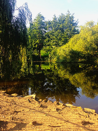
This is an image of a lake in a secluded park; the lake seems to be isolated by surrounding trees, the fact that this lake is a natural beauty yet no one seems captivated by it intrigues me. You can see the reflection of the trees bouncing off the water making the reflection to create the illusion that it is almost touching the trees itself. I have chosen to centre my main focal point which is the lake as it gives it a more aesthetically pleasing feel, and to help capture the reflection of the tree mirroring off the water. I took this photo on a bright, clear, sunny day because I wanted to capture a crisp reflection on the water. This image was successful with regards to the combination of the composition and lighting working well to give a dramatic atmosphere. I used Photoshop to change the saturation and vibrancy of the image so that the image can look more alive, I felt as thought the original image was to dull and lifeless. I intended for this image to create a sense of calmness for the viewer, in my opinion the image is very tranquil and peaceful, therefore, adding this sense of calm beauty and life.
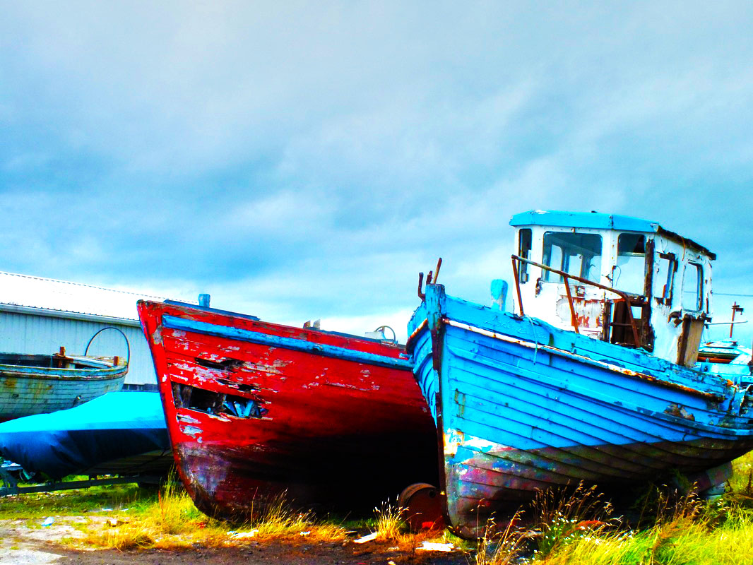
This is an image of two boats at the beach; the boats are old and appear to be abandoned possibly wrecked at sea over a long period of time and left behind. The fact the boats are on dry land was unusual and caught my eye I chose to document the boats as I found them and felt that my image was more successful unedited. One possible story behind the two boats could be that they are fishing boats that have been left to rot after being abandoned by the fishermen for new boats, the scratched paint and rotten broken wood tells a story of how the boats have been not only abandoned by the fishermen but also abandoned by the sea. I have chosen to use the rule of thirds to emphasis the subject, the contrasting bold colours of the red and blue boats create a dramatic atmosphere against the skyline. I photographed the boats in the afternoon on a cloudy because I wanted to use the defused lighting into highlight the contrasting colours without having harsh shadows. This image was successful with regards to the combination of the composition and lighting working well to give a dramatic atmosphere, one limitation of the image is the covered up blue speed boat in the background distracts the eye. I used Photoshop to change the saturation of the image to enhance the contrast and colours. I chose to make this edit as I felt the original image was dull and the colours were faded, the change in saturation was successful as it brought life to the boats and skyline making the photograph more aesthetically appealing. I intended for this image to make the viewer feel a sense of sadness for the abandoned subject while still capture the beauty of the old boats and the location. The boats have been abandoned by the sea leaving them to adopt an eerie stillness, only reflection of their former selves. For me although the beauty within the sadness of the image is predominant someone else may perceive the image differently viewing the boats as rubbish left behind and worth recording. Links to next step: This contact sheet and in particular this image has inspired me to photograph my objects like the boats within my landscapes and continue trying to find the unique beauty of unusual subjects. One location I plan to visit is around the river Thames in London.
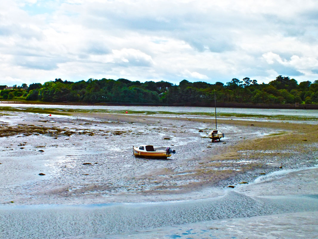
This is a picture of two boats beached in the middle of the bay when the tide is out; the boats seem to have been stranded, as if they weren't the owners would have brought them into port. The closest boat in our view looks like a type of speed boat, whereas, the second boat although you can’t see the full body of the boat to me looks like a fishing boat. What caught my eye about this composition and why I chose to photograph it was the sheer complexity as to why these boats have been left to become beached, especially if the owners are still going to use the boat they would not leave them stranded in the middle of a bay, with no way to get back to them. One story that could be behind this picture is the possibility that they are ruin down broken boats in which does not have the strength to be moved. So now the only moving they do is rising with the sea when the tide comes in. Again in this photo, I composed it by following the rule of thirds both horizontally and and vertically, by having them slightly off centre and zoomed out, helps create this idea of the boats being lost and forgotten. The way in which the boats seem to blend into the surrounding colours emphasises on this idea that they are becoming one with the sea. I used Photoshop again for this image to enhance the vivid colours in which are in the background, to do this I saturated the image and used the brightness and contrast tool to exaggerate the image further. I chose to edit the image in this way because the original image was bland and dark, the colours were mostly a faded dull tone. the edit was a success as it became more aesthetically pleasing and attractive to the viewer, by doing the edit it also helped to create more depth to the photograph as the boats no longer blend into the background but are making their own statement in the foreground. When composing this image I wanted to make the viewer feel some sort of loneliness brought upon them just like the boats in the photo, however, still capture the essence of life and hope throughout the location. After doing both these contact sheets as an initial starting point for this project, I am going to keep looking and documenting landscapes, and look at black and white landscape photographers.
Ansel Adams
Ansel Adams was a renowned American photographer and environmentalist who primarily used large-format cameras because of their high resolution which helped ensure sharpness in his images. His black-and-white photographs of the American West, especially Yosemite National Park have been widely reproduced on calendars, posters, and in books.
Adams, (Feb. 20 1902 — Apr. 22, 1984), photographer and environmentalist, was born in San Francisco, California, the son of Charles Hitchcock Adams, a businessman, and Olive Bray. The grandson of a wealthy timber baron, Adams grew up in a house set amid the sand dunes of the Golden Gate. If Adams’s love of nature was nurtured in the Golden Gate, his life was, in his words, “coloured and modulated by the great earth gesture” of the Yosemite Sierra. He spent substantial time there every year from 1916 until his death. From his first visit, Adams was transfixed and transformed. He began using the Kodak No. 1 Box Brownie his parents had given him. He hiked, climbed, and explored, gaining self-esteem and self-confidence. Adams’s energy and capacity for work were simply colossal. He often labored for eighteen or more hours per day, for days and weeks on end. There were no vacations, no holidays, no Sundays in Ansel Adams’s life. Adams described himself as a photographer, lecturer and a writer. It would perhaps be more accurate to say that he was indeed simply and compulsively a communicator. He endlessly traveled the country in pursuit of both the natural beauty he revered and photographed and the audiences he required.
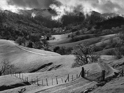
This image by Adams is a digital image presented in black-and-white, the black-and-white effect has played well with capturing the shadows and highlights through the image. The landscape appears to be mountainous valleys in which may be used for farm land, as in the bottom right corner of the image you can see a road that has had a gate placed through it, this can only suggest that it is someones land. The photographer may be trying to tell a story of loneliness or even a story of being deserted, this is because it may look like somebody owns this land due to the fencing around but we as the viewers can not see the area behind what Adams has taken. this may have been thriving farm land at one point in time but the evidence in the image suggests that it was only in the past due to the high lack of life within the photograph. When looking at this image you gain a sense of loneliness and eeriness, I feel like this is due the the lack of life there is, when you see the countryside you aspect houses dotted around in the distance and farm life grazing in the fields, whereas, in this image there is nothing, even the trees are dying, creating a strong melancholy effect on the viewer.
The photograph seems to have been taken in the early hours of the morning as you can see the fog disappearing from the tops of the mountains. Adams has centred his image successfully creating an eerie, slightly off putting feel to the image.
Adams, (Feb. 20 1902 — Apr. 22, 1984), photographer and environmentalist, was born in San Francisco, California, the son of Charles Hitchcock Adams, a businessman, and Olive Bray. The grandson of a wealthy timber baron, Adams grew up in a house set amid the sand dunes of the Golden Gate. If Adams’s love of nature was nurtured in the Golden Gate, his life was, in his words, “coloured and modulated by the great earth gesture” of the Yosemite Sierra. He spent substantial time there every year from 1916 until his death. From his first visit, Adams was transfixed and transformed. He began using the Kodak No. 1 Box Brownie his parents had given him. He hiked, climbed, and explored, gaining self-esteem and self-confidence. Adams’s energy and capacity for work were simply colossal. He often labored for eighteen or more hours per day, for days and weeks on end. There were no vacations, no holidays, no Sundays in Ansel Adams’s life. Adams described himself as a photographer, lecturer and a writer. It would perhaps be more accurate to say that he was indeed simply and compulsively a communicator. He endlessly traveled the country in pursuit of both the natural beauty he revered and photographed and the audiences he required.
This image by Adams is a digital image presented in black-and-white, the black-and-white effect has played well with capturing the shadows and highlights through the image. The landscape appears to be mountainous valleys in which may be used for farm land, as in the bottom right corner of the image you can see a road that has had a gate placed through it, this can only suggest that it is someones land. The photographer may be trying to tell a story of loneliness or even a story of being deserted, this is because it may look like somebody owns this land due to the fencing around but we as the viewers can not see the area behind what Adams has taken. this may have been thriving farm land at one point in time but the evidence in the image suggests that it was only in the past due to the high lack of life within the photograph. When looking at this image you gain a sense of loneliness and eeriness, I feel like this is due the the lack of life there is, when you see the countryside you aspect houses dotted around in the distance and farm life grazing in the fields, whereas, in this image there is nothing, even the trees are dying, creating a strong melancholy effect on the viewer.
The photograph seems to have been taken in the early hours of the morning as you can see the fog disappearing from the tops of the mountains. Adams has centred his image successfully creating an eerie, slightly off putting feel to the image.
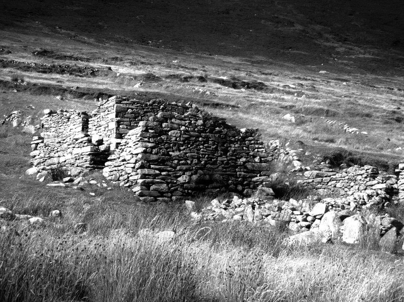
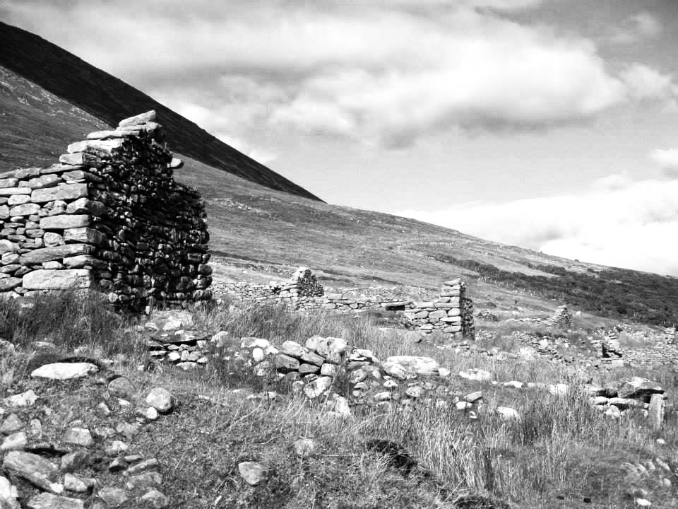
This is an image of what seems to be ruins of a stone house; the ruins are run down over the years and most of the building has turned to rubble after being desolate for so many years. The fact that the based exterior of this house still stands from what could possibly be over hundreds of years in which this house was lived in and built caught my eye. Moreover, I captured this image because I was intrigued by the sheer isolation in which surrounds this abandoned building, and I question its history from which it has seen, such as, who lived there before, and why did they choose to live in such an 'un-lived in' environment. I have chosen to slightly centre the subject so that it can
create more of an eerie emotion to the already desolate image. The dark shadows
in this image are defined more since using a monochrome effect. I photographed
this image mid-day so that I could get the most out of natural shadows. This image
was successful with reference to the tonal shading created with the lighting
and composition, helping to create a melancholy, dramatic atmosphere, one
limitation of this image is that I would have liked a sharper focus on the
subject. I used Photoshop to create a monochrome effect on the image. I chose to do this because I was relating this enlargement to Ansel Adams who is known for his black and white images. Furthermore, I used Photoshop to add more definition to the composition, to do this I added more tone, shadow and highlighted more areas to help define the shadow and stones.
I intended for the viewer to feel a sense of history when looking at this image but also a sense of sadness and isolation however, I want them so still see the aesthetic beauty of the image. The house has been abandoned by the owners to go to ruin. For me although the beauty within the sadness and the question of the houses history is predominant someone else may perceive the image differently viewing the house as just ruins of an old house and not worth recording.
I intended for the viewer to feel a sense of history when looking at this image but also a sense of sadness and isolation however, I want them so still see the aesthetic beauty of the image. The house has been abandoned by the owners to go to ruin. For me although the beauty within the sadness and the question of the houses history is predominant someone else may perceive the image differently viewing the house as just ruins of an old house and not worth recording.
|
|
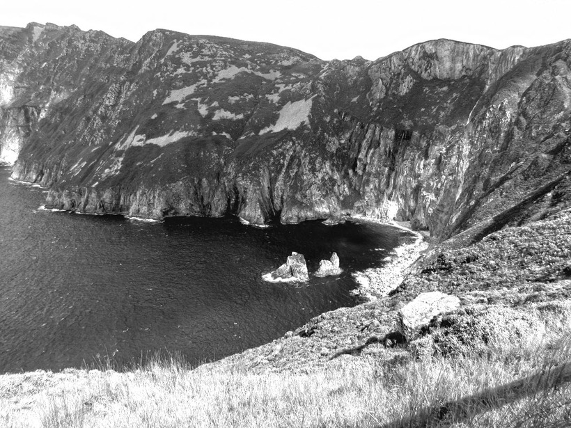
This is an image of a cliff face looking on to the sea; it is a landscape image in which was taken from one side of a cliff face looking out towards the other side. What caught my eye in this image was the detailing of the rocks, and the structure the cliff face has formed over time due to eroding. I have chosen to use the rule of thirds in this so that it becomes more aesthetically appealing for the viewer. I photographed this image on a cloudy, slightly dull day so that I could try a gain the clouds shadows coming across the land. As you can see my attempt at doing this was more unsuccessful as I planned as I was only able to capture the shadow in the far left hand corner of the cliff face. However, in some ways the image was more of a success due to the clouds blocking most light the detailing in the rock became more defined and prominent, causing a more dynamic and dramatic atmosphere throughout the image. I used Photoshop to change the image into black and white effect following the works of Adams. Also I enhanced the density of the details in the rock by using the HDR Toning tool and changing the detail tool to more defined. I intended for this image to make the viewer feel a sense of power this is because I feel that slight sense due to the vast size of the cliff face. However, to still capture the majestic beauty of the image. This contact sheet in particular has inspired me to look at more monochrome photographers, specifically to look at photographer who document cityscapes as I feel that relates more to me as I live in the city of London, therefore, by documenting London I can feel closer to this project.
Horst Hamman
Horst Hamann is a genius of composition, not only in his framing of architectural forms but in his treatment of light as well. His gradations of grey, the deluxe velvet's of his blacks combined with the unexpected angles from which he often shoots, bring an oddly abstract quality to these sharply focused renderings of urban texture.'
The New York Times
The grandeur of New York City's horizons and vertical heights have never been recorded with as much accuracy as in Horst Hamann's photographs. The unconventional size of his pictures, two metres tall, combined with the dramatic angles in the composition make a direct representation of New York as a symbol of towering ambition.
Born in Mannheim, Germany, Horst Hamann first visited New York in 1979. Ten years later Hamann moved to New York permanently to begin his twenty year study of Manhattan and its lofty views. While tall buildings punctuate urban centres all over the world, it is New York's Manhattan in particular that has become synonymous with these monumental structures. "New York became my passion", Hamann recalls of his early experiences traversing the city on his many photographic assignments.
Today it is difficult to imagine New York looking like anything other than the power city captured in New York Vertical. In Hamann's hands the panoramic camera is subject to a radically different task. Breaking with tradition, Hamann tilts his Linhof Technorama 90 degrees to realise the lengthy vertical potential. His eye for lining up dramatic shots with mathematical accuracy give Hamann's photographs a unique character.
Hamann has worked for international magazines and publishers. His work has been exhibited worldwide. Hamann's book New York Vertical, has turned out to be an international bestseller with more than 150.000 copies printed. He is the recipient of the KodakPhotobook Award. His work appears in many public and private collection.
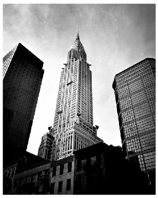
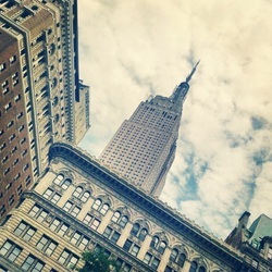
This image by Hamann is a digital photograph which has been presented in black and white, this image is linked to many of his works based upon New York City. This photograph is an image of the Empire State building, it has been taken at ground level looking up at an angle to really enhance the height of the famous landmark. It is surrounded by buildings, however, Hamann is still able to show the vast dynamic structure of the Empire State building compared to all the others surrounding. Due to the piece being in black and white I can't really decipher what time of day it is exactly but I can see that the photographer took this image of a cloudy day. Hamann has centred his composition causing the idea of the Empire State building being the most powerpoint, prominent building. Although the photograph is aesthetically pleasing I believe that an emotional response can be evoked if the viewer has a personal relationship with the location.
I have chosen to analyse this image because when looking for a black and white photographer Hamann's work intrigued me the most, this image and other works of Hamann relates to my project because I am interested in black and white photography and wanted to move on to do cityscapes, I plan to take photographs of my local area in the same technique in which Hamann uses, such as the angles in which he structures his subject and composition.
The New York Times
The grandeur of New York City's horizons and vertical heights have never been recorded with as much accuracy as in Horst Hamann's photographs. The unconventional size of his pictures, two metres tall, combined with the dramatic angles in the composition make a direct representation of New York as a symbol of towering ambition.
Born in Mannheim, Germany, Horst Hamann first visited New York in 1979. Ten years later Hamann moved to New York permanently to begin his twenty year study of Manhattan and its lofty views. While tall buildings punctuate urban centres all over the world, it is New York's Manhattan in particular that has become synonymous with these monumental structures. "New York became my passion", Hamann recalls of his early experiences traversing the city on his many photographic assignments.
Today it is difficult to imagine New York looking like anything other than the power city captured in New York Vertical. In Hamann's hands the panoramic camera is subject to a radically different task. Breaking with tradition, Hamann tilts his Linhof Technorama 90 degrees to realise the lengthy vertical potential. His eye for lining up dramatic shots with mathematical accuracy give Hamann's photographs a unique character.
Hamann has worked for international magazines and publishers. His work has been exhibited worldwide. Hamann's book New York Vertical, has turned out to be an international bestseller with more than 150.000 copies printed. He is the recipient of the KodakPhotobook Award. His work appears in many public and private collection.
This image by Hamann is a digital photograph which has been presented in black and white, this image is linked to many of his works based upon New York City. This photograph is an image of the Empire State building, it has been taken at ground level looking up at an angle to really enhance the height of the famous landmark. It is surrounded by buildings, however, Hamann is still able to show the vast dynamic structure of the Empire State building compared to all the others surrounding. Due to the piece being in black and white I can't really decipher what time of day it is exactly but I can see that the photographer took this image of a cloudy day. Hamann has centred his composition causing the idea of the Empire State building being the most powerpoint, prominent building. Although the photograph is aesthetically pleasing I believe that an emotional response can be evoked if the viewer has a personal relationship with the location.
I have chosen to analyse this image because when looking for a black and white photographer Hamann's work intrigued me the most, this image and other works of Hamann relates to my project because I am interested in black and white photography and wanted to move on to do cityscapes, I plan to take photographs of my local area in the same technique in which Hamann uses, such as the angles in which he structures his subject and composition.
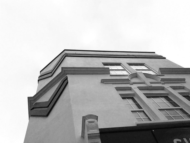
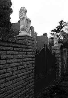
This is an image of a building taken at an angle, looking up from the floor, using the style of Horst Hamman I have been able to manipulate the image so that the building looks and feels larger than it is. The building is basic with only minimal detail making it look less of an importance in stature, this is because when looking at important buildings usually such as in the centre of cities the majority of them do have a lot of intricate details through out the building. I photographed this building from the floor and looking up at an angle, the largeness in which is created from doing this creates a sense of majestic stature. I photographed this image on a very cloudy afternoon so that the white of the cloud can make the structured building to stand out. This was successful as the cloud has seemed to sharpen the outline of the building causing it to 3-D like in a way. I used Photoshop to change the image into black and white, after doing this to exaggerate the building even more I enhances the shadows and highlighting of the image so that the little intricate details in the frame work of the building is more notice able. The mood in which is created in this photograph I feel is a powerful one, it creates a sense of power and importance yet also I feel as though a sense of purity and innocence due to the prominent white in the image. Also you could say that it seems to hold a sense of history, this is preferably due to the monochrome effect as most old photos are in black and white.
|
|
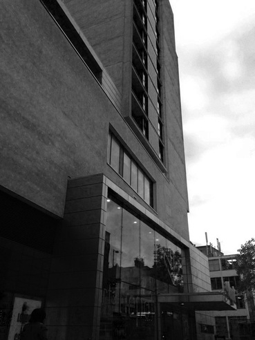
I shot this photograph with a digital camera, the main subject of the image is the large building this can be found in the foreground. The reason I chose this building as the main focus of the image was to convey a sense of power and greatness. This relates to my theme of perception with in colour as the monochrome effect that Hamman uses already creates a sense of seriousness, therefore by using a large building in which towers over you as the subject of the image it helps to convey this authoritarian image in which I wanted to create. For my composition I used the rule of thirds to bring attention to the building as well as to create an aesthetically appealing image, moreover, I took the image from a low level so I could angle the image in the same style of Horst Hamman. One success of the composition is that it allows the viewer to experience the vast greatness of the building due to the angling, the image is angled in away that shows the viewer exactly what they would see if they were under the building. In the background we can also see other buildings, however we can only see the tops of them as I focused on the height of the building in the foreground. I feel this adds to my image as it helps to show how tall and authoritative this building actually is, if I were to compose this image differently I would angle the image even more to show the whole building. The photograph was shot outdoors using natural lighting. The reason I used this lighting technique is to allow the viewer to capture the natural lighting in which the building usually is seen with.
Through this image I have explored the idea of how an image shown in black and white and is also at an angle can change the way someone perceives the subject matter. I want the viewer to feel as though this building has a powerful importance this is because it relates to my theme of perception.
Next Step: This contact sheet has inspired me to research the work of Allen Klosowski as it relates to my theme of perception and Klosowski's photographs also has the same style of angling the image like Hamman's. By exploring Klosowski I will then shoot images in the centre of London using the natural outdoor lighting and have more prominent buildings as my main subject in order to explore the idea of perception.
Allen Klosowski
Allen Klosowski is widely known for his photography business shared with his wife in which both of them share a love and passion for photography, in this business they mainly base their skills in photographing weddings. However, Allen Klosowski is also known for his cityscape photography in which he captures different cities around the world in aesthetically pleasing yet unusual angles.
This image by Klosowski is a digital photograph which has been presented in colour, although has been edited so that the colours are softer yet still realistic.
In this cityscape photograph you can see that it has been taken in New York and the Empire State building is the main subject matter of the photograph. The way in which Klosowski has composed this image plays with angling and the framing, it differs from how most photographers would capture the Empire State building and its iconic structure. By composing his photograph so that Klosowski captures the city buildings around the landmark creates an obscure yet very attractive photo.
The photograph seems to have been taken on a cloudy day, possibly in the morning as you can see the blue sky trying the breakthrough the cloud. The way in which he has captured New York has portrayed it to be a peaceful city in which not much happened, however, we all know that it is 'the city that never sleeps'.
I have chosen to analyse this image because it caught my eye and found it the most interesting throughout his works, this image and the other works of Klosowski links to my project because I am exploring cityscapes in a similar way, I plan to take photographs using the same techniques of angling in the city of London as it is where I live and have grown up in all my life.
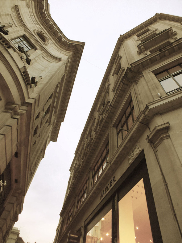
This is an image of to buildings taken in the centre of London to represent the photographers work. You can see that these buildings have been transferred into shops however, it makes you question what is the history behind these large, extravagant buildings such as what were these buildings before, or why were they changed, as just by looking at the exterior of these buildings you can see that they were important or that the people who lived in them were very wealth and important. I had chosen to take this photograph looking up at the building because I feel as though it creates an element of dimension and stature. I used a slight rule of thirds with this image as you can see the buildings aren't centred. I did this because due to the height and angle of the buildings I wanted to make the image powerful due to the possible history behind the building but I also want to make the image aesthetically pleasing and beautiful, in which I think has been successful. For this image I used photoshop to manipulate the colouring to the image, like Allen Klosowski to create this washed out effect, although I I have washed out the image, I feel as though it creates an interesting effect and also enhances that feeling of history in which I was trying to portray.
|
|
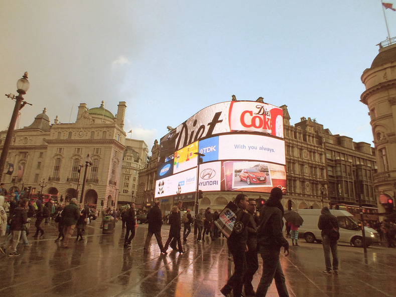
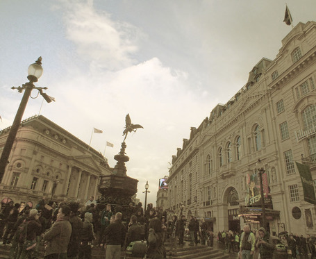
I shot this photograph with a digital camera, the main subject of the image is the Piccadilly lights. This can be found in the background. The reason I chose the Piccadilly lights as the main focus of the image was to convey a sense of modernism throughout the old buildings of London, this relates to my theme as I am linking the landscape side of my project to London and also like Klosowski taking photos of iconic landmarks in New York I am doing the same but in London. For my composition I used the centered rule to bring attention to the Piccadilly Lights. As well as to create a clear focused image. One success of the composition is that it allows the viewer to see and experience the lights at eye level, for this image I wanted to make the composition as natural as possible and in my opinion I feel that this was successful. In foreground we can also see many people walking around, I feel this adds to the image because it helps to create this natural effect in which I was trying to convey. If I were to compose this image differently I would have made sure the lights were centered correctly as you can see that there are slightly more to the right. The photograph was shot outdoors natural lighting. For this image again I manipulated the colour of the image to make it have a washed out, vintage effect this was done using Photoshop. I done this so it could link to Allen Klosowski's work and also it helps me to experiment with the different view points in which people will perceive this coloured effect.
Complex Issues: Through this image I have explored the idea of a different effect of colour on the image. The combination of the formal elements and the subject matter create an image which is successful in conveying the idea of perceiving colour by captivating the viewer with the odd yet warm colouring . I want the viewer to feel intrigued because this mood relates to my theme of perceiving colour.
Next Step: This contact sheet has inspired me to research the work of Christophe Jacrot as it relates to my theme of perception. By exploring Christophe Jacrot I am taking the idea of diffused colour effect and developing the idea that I want to diffuse what the viewer can see to help explore the different ways that a person can perceive an image. I will then shoot images using outdoor lighting and again a parts of London as my main subject in order to explore the idea of perception within a photograph.
further development of ideas
Christophe Jacrot
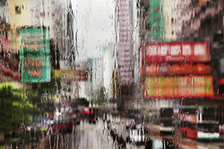
Christophe Jacrot was born in 1960 and lives in Paris. He has been into photography since he was a child, but he made his name through cinema first. He has directed a number of short films, a lot of them having received prizes. One of them was 'Lifting'. In 2000, he directed a full-feature movie 'Prison À Domicile'. However, Christophe Jacrot found it difficult to develop other projects a the cinema and this in turn led him to photography, an art he can practise alone and with no constraints. His work on bad weather and downpours started when he was asked to take pictures of Paris in the sun for a travel guide. He explained how "The weather was desperately bad, and it gave [him] the desire to take an opposite stance to the traditional Paris photos and seize these atmospheres at it had rarely been done. Jacrot had in mind the fabulous portrait Henri Cartier-Bresson had taken of Giacometti under pouring rain, and of the photo of a man jumping in front of a puddle at the trocadero which Eliott Erwitt had taken."
His first exhibit was called 'Paris in the Rain', at the Lucernaire in Paris, in October 2007; it immediately led to the publication of a book at Le Chene publications. Today, he was exhibits in Paris, New York, Boston and Istanbul. Christophe Jacrot is a bad weather globe trotter who hunts the poetry of rain storms on all the continents.
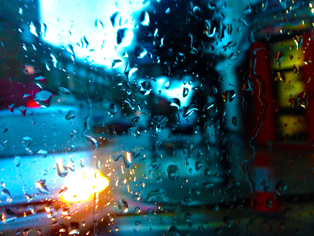
This is a digital photograph which has been presented in colour. The colours in this image seems to have been enhanced so that they stand out although have not broken away so they are unrealistic. This photograph is taken of a cityscape in the background but Jacrot has taken more of an interest in the rain drops on the window. As you can see because Jacrot has focused on the rain drops the image of the city has become blurred and distorted . It interests me in the way that the distortion removes the detail and only leaves behind the colour, however the viewer can still recognise the landscape and the objects within it just using colour.
His first exhibit was called 'Paris in the Rain', at the Lucernaire in Paris, in October 2007; it immediately led to the publication of a book at Le Chene publications. Today, he was exhibits in Paris, New York, Boston and Istanbul. Christophe Jacrot is a bad weather globe trotter who hunts the poetry of rain storms on all the continents.
This is a digital photograph which has been presented in colour. The colours in this image seems to have been enhanced so that they stand out although have not broken away so they are unrealistic. This photograph is taken of a cityscape in the background but Jacrot has taken more of an interest in the rain drops on the window. As you can see because Jacrot has focused on the rain drops the image of the city has become blurred and distorted . It interests me in the way that the distortion removes the detail and only leaves behind the colour, however the viewer can still recognise the landscape and the objects within it just using colour.
|
|
Step 1
I created a new document with Width 1400px and Height 1200px.
Step 2
First of all, I opened the image on which I wanted to apply the rain effect. I clicked Ctrl+ A to select the image, then pressed Ctrl+ C to copy it. Finally, I went to the new document and click on Ctrl+ V to paste this image in a new layer. I then pressed Ctrl+ T to resize according to your requirement.
Step 3
Next I needed to create the rain then its detailing. To do so, I created a new layer above the image layer. Filled it with # 000000 color using ‘paint bucket tool’ and label it as ‘rain1’. Then I went to Filter> Add noise and used these following values > 20% of noise > Distribution - Gaussian > monochromatic
Step 4
After that, I went to Filter> Blur> Motion blur and used the following settings. I adjusted the angle to 75 degrees and distanced the pixels to 25
I then set the blending mode of this layer to ‘screen’.
Step 5
I created a new layer at the top, and labelled it as ‘rain2’. Fill it with # 000000 color using ‘paint bucket tool’. Then went to Filter> Add noise and used the following settings here > 30% > Distribution - Gaussian > Monochromatic
Step 6
After that, I went to Filter> Blur> Motion blur and kept the angle the same at 75 degrees but changed the distance to 25
Finally I set the blending mode of this layer to ‘screen’ and opacity as 70%.
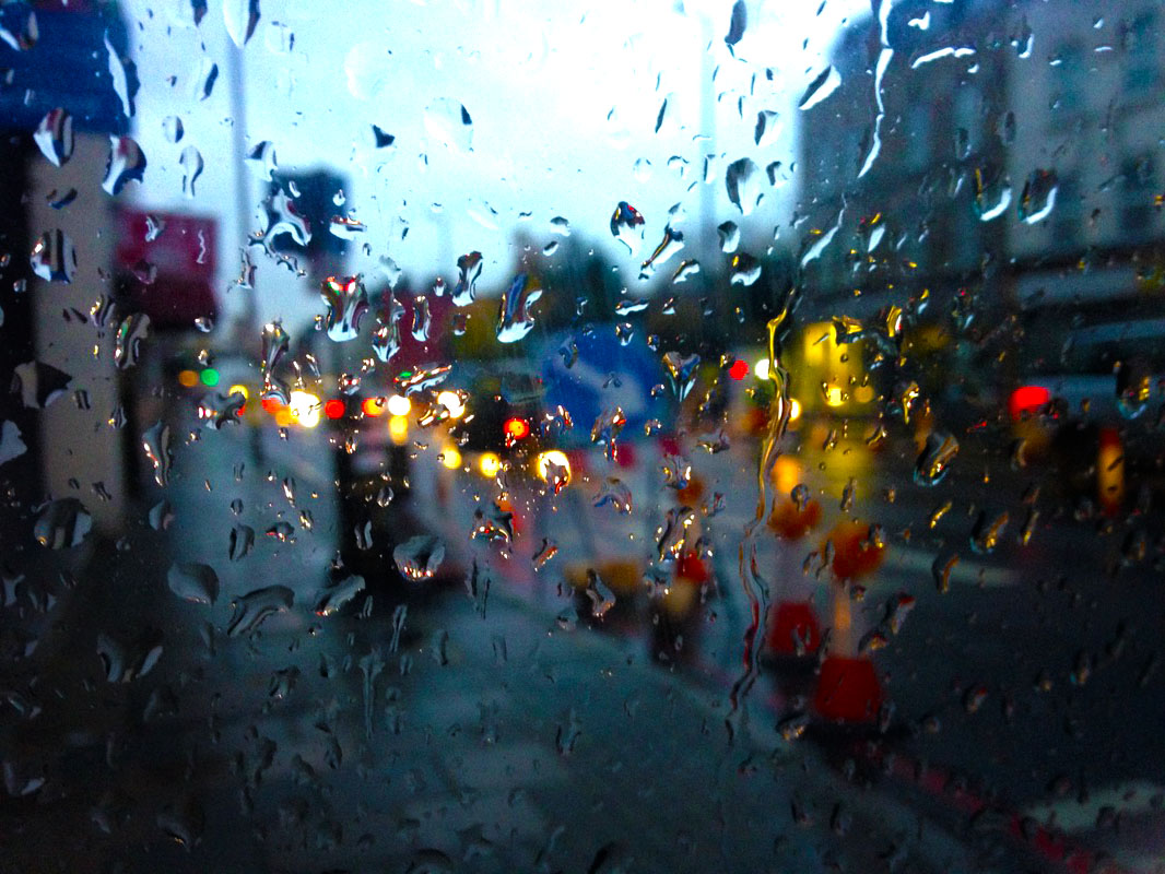
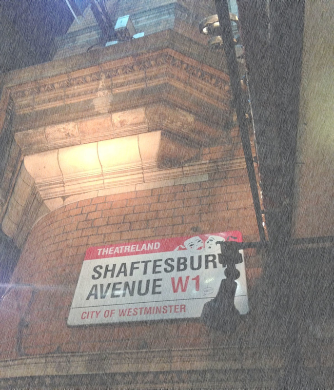
I shot this photograph with a digital camera, the main subject of the image is the street sign. This can be found in the background. The reason I chose the street sign as the main focus of the image was to convey a sense of the different parts of London and as you can see by the street sign there is a small red column at the top saying 'Theatreland', therefore it is showing that in this part of London it is strongly represented by the theatre productions. For my composition I used the rule of thirds to bring attention to the sign as well as to create an aesthetically appealing image. The photograph was shot outdoors natural lighting. I used photoshop in this image to create the effect of it raining, I did this to experiment with the way Christophe Jacrot took his photos, I feel that this was a success as it looks like it s raining in the picture however, it doesn't have the same effect as Jacrot's photos through the window as it the photoshop has not got the same blurriness and focusing of the water droplets.
Next Step: These sets of contact sheets has inspired me to research the work of Stephanie Jung as it relates to my theme of perception and seeing things differently. By exploring Stephanie Jung I will then shoot images using outdoor lighting and again experiment with the use of photoshop to see how the photoshop can manipulate our perceptions.
Next Step: These sets of contact sheets has inspired me to research the work of Stephanie Jung as it relates to my theme of perception and seeing things differently. By exploring Stephanie Jung I will then shoot images using outdoor lighting and again experiment with the use of photoshop to see how the photoshop can manipulate our perceptions.
Stephanie jung
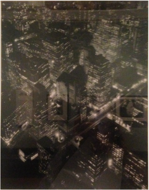
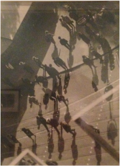
Stephanie Jung is from Schifferstadt, a small town in South-West Germany, but she spends a lot of time in Berlin during the year. In 2010 she finished her studies in Visual Communications, where she discovered her passion for experimental photography. Since then she is working as a freelance photographer, focussing on her personal projects. She loves to travel all over the world, especially to big cities, to capture the vibrant and hectic mood of a place. But her work is not just about citylife, it's about time and caducity, about capturing special moments getting lost in time. Some of her work has been published in different magazines as well as exhibited in art galleries.
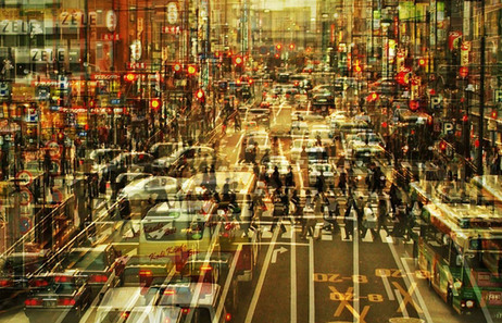
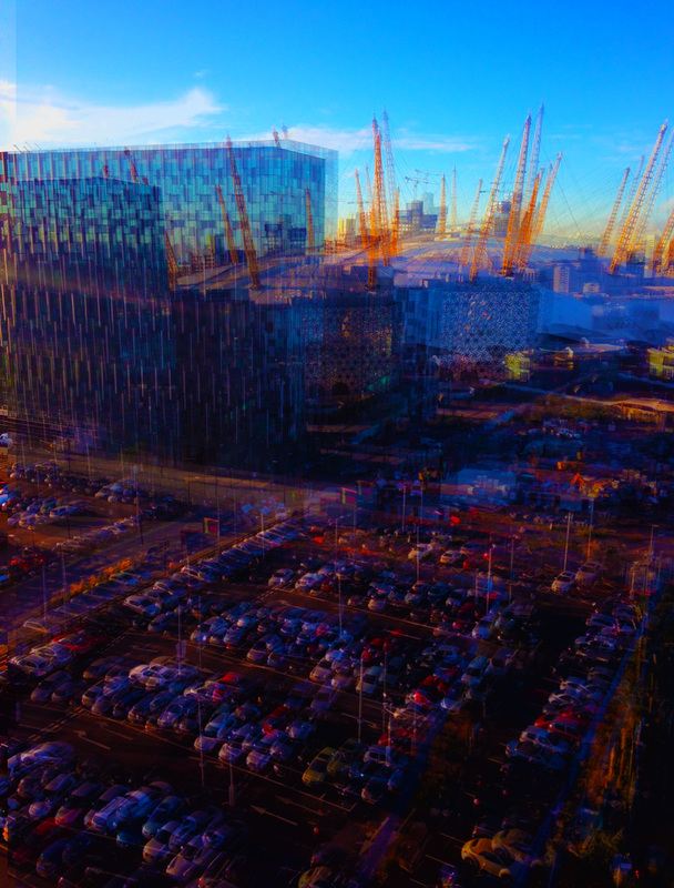
As you can see with Jung's photography she uses a repeated pattern of to same photo layered on top of each other in this way I am intrigued by this and want to link it into my work because I feel as though I can explore not only the landscape through colour but also the passing through time, furthermore, when seeing this image I feel as though it may relate to a certain degree what some people who suffer with synesthesia may see and their perception of the world, therefore I want to experiment with photoshop what it must be like to experience the world as a synthetic.
As you can see with Jung's photography she uses a repeated pattern of to same photo layered on top of each other in this way I am intrigued by this and want to link it into my work because I feel as though I can explore not only the landscape through colour but also the passing through time, furthermore, when seeing this image I feel as though it may relate to a certain degree what some people who suffer with synesthesia may see and their perception of the world, therefore I want to experiment with photoshop what it must be like to experience the world as a synthetic.
|
|
I shot these photographs with a digital camera and edited it with photoshop to create the same affect that Jung has in her work, the main subject of the image is the area around the O2 centre in London. This can be found in the background. For both composition I used the rule of thirds to help accentuate the edit of the photoshop, as well as to create an aesthetically appealing image. One success of the composition is that it allows the viewer experience this idea of synthetic with the colours and the repeated photo. The photograph was shot outdoors.
Through this image I have explored the idea of synaesthesia . The combination of the formal elements and the subject matter create an image which is successful in conveying the same technique as Stephanie Jung.
Next Step: This contact sheet has inspired me to research more on synaesthesia as it relates to my theme of perceiving the image and what people see.
This shows the stages of how I created the process
Synesthesia
Synesthesia is a condition in which one sense (for example, hearing) is simultaneously perceived as if by one or more additional senses such as sight. The reason why this happens is yet to be discovered although it has been determined that is runs in families and is an autosomal dominant trait. Synesthesia cannot be learnt or acquired. You either have it or you don't. As it is a neurological phenomenon, the brains of synesthetes (people who experience synesthesia) are wired slightly differently to those who don't experience it.
The estimated numbers of people who have this condition vary greatly from 1 in 20, to 1 in 200 or even one in a million.
The word synesthesia comes from two Greek words, syn (together) and aisthesis (perception). Therefore, synesthesia literally means "joined perception." Synesthesia can involve any of the senses.
The most common form, coloured letters and numbers, occurs when someone always sees a certain colour in response to a certain letter of the alphabet or number. For example, a synesthete (a person with synesthesia) might see the word "plane" as mint green or the number "4" as dark brown.
There are also synesthetes who hear sounds in response to smell, who smell in response to touch, or who feel something in response to sight. Just about any combination of the senses is possible. There are some people who possess synesthesia involving three or even more senses, but this is extremely rare.
Synesthetic perceptions are specific to each person. Different people with synesthesia almost always disagree on their perceptions. In other words, if one synesthete thinks that the letter "q" is coloured blue, another synesthete might see "q" as orange.
Synesthesia comes in a number of forms:
Graepheme - Colour: the person experiences letters and words as having different colours. Different people have different colours. "A" is often red, although not everyone experiences it like that.
Sound - Colour: the person experiences notes as having different colours. They can literally see music.
Number - Colour: the person experiences numbers as having colours. Sometimes the individual numbers (0-9) have colours, whereas some people see entire numbers as being a certain colour (like 87 is a shade of green). The colours are also very specific. The person knows the exact shades.
Personification: this is where numbers of letters of the alphabet have different personalities. e.g: 3 is fitness freak and athlete in a yellow shirt.
Gustatory: the person experiences words, sounds or letters as "tasting" a certain way. E.g: 9 tastes like purple chocolate or "q" tastes like candle wax.
There are also two way of synesthetic experiences, related specifically to the graepheme-colour and sound-colour varieties. The person may "see" the colour in their head, whereas some can literally see the colour in front of them. As if the words had different colours themselves.
As the person is born this way, they often think that other people experience this too and are quite surprised when they learn that others don't.
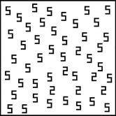
An example: Someone with grapheme-colour synesthesia will recognise almost immediately that there is a triangle of 2's in this diagram because they can see the colours, whereas the 'normal' person will have to look longer and harder.
The diagnostic criteria are as follows:
Graepheme - Colour: the person experiences letters and words as having different colours. Different people have different colours. "A" is often red, although not everyone experiences it like that.
Sound - Colour: the person experiences notes as having different colours. They can literally see music.
Number - Colour: the person experiences numbers as having colours. Sometimes the individual numbers (0-9) have colours, whereas some people see entire numbers as being a certain colour (like 87 is a shade of green). The colours are also very specific. The person knows the exact shades.
Personification: this is where numbers of letters of the alphabet have different personalities. e.g: 3 is fitness freak and athlete in a yellow shirt.
Gustatory: the person experiences words, sounds or letters as "tasting" a certain way. E.g: 9 tastes like purple chocolate or "q" tastes like candle wax.
There are also two way of synesthetic experiences, related specifically to the graepheme-colour and sound-colour varieties. The person may "see" the colour in their head, whereas some can literally see the colour in front of them. As if the words had different colours themselves.
As the person is born this way, they often think that other people experience this too and are quite surprised when they learn that others don't.
An example: Someone with grapheme-colour synesthesia will recognise almost immediately that there is a triangle of 2's in this diagram because they can see the colours, whereas the 'normal' person will have to look longer and harder.
The diagnostic criteria are as follows:
- Synesthesia is involuntary and automatic. (It happens whether you want it or not. It cannot be willed or created, it comes on its own)
- Synesthetic perceptions are spatially extended, meaning they often have a sense of "location." For example, synesthetes speak of "looking at" or "going to" a particular place to attend to the experience.
- Synesthetic perceptions are consistent and generic (i.e., simple rather than pictorial). (Colours or tastes always remain the same)
- Synesthesia is highly memorable.
- Synesthesia is laden with affect. (There is emotion involved, if someone says that 5 is red and the person experiences it as being blue it evokes an uncomfortable response inside)
|
|
|
These videos I have uploaded help to understand and show in more detail about the Synesthsia condition
Rebecca Horn
Since the beginning of the 1970s, Rebecca Horn has been creating an oeuvre which constitutes an ever-growing flow of performances, films, sculptures, spatial installations, drawings and photographs. The essence of their imagery comes out of the tremendous precision of the physical and technical functionality she uses to stage her works each time within a particular space.
Gallery visits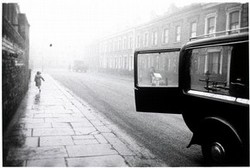
Robert Frank (born 1924)
London Street 1951, printed 1979 Gelatin silver print Museum no. Ph.1229-1980 In this foggy London street scene Frank aligns a number of seemingly unrelated elements into a coherent picture. On the left a running child is reflected in the wet pavement, while in the foreground the open door of a hearse frames the grainy form of a rubbish collector. The solid black bulk of the vehicle is set off by the soft greys of the houses, fading almost to white in the distance. It links to my project as I have been looking at black and white photography and cityscapes. |
|
|
|
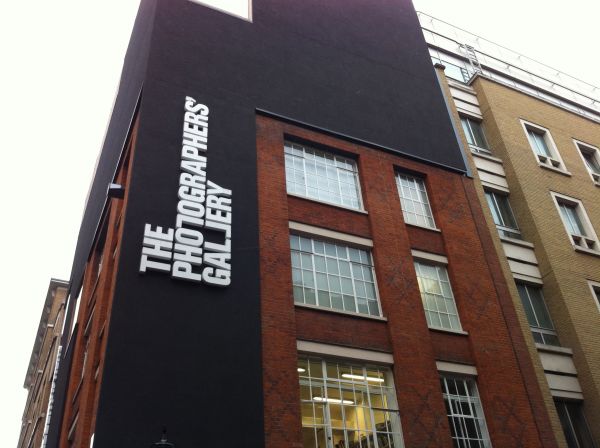
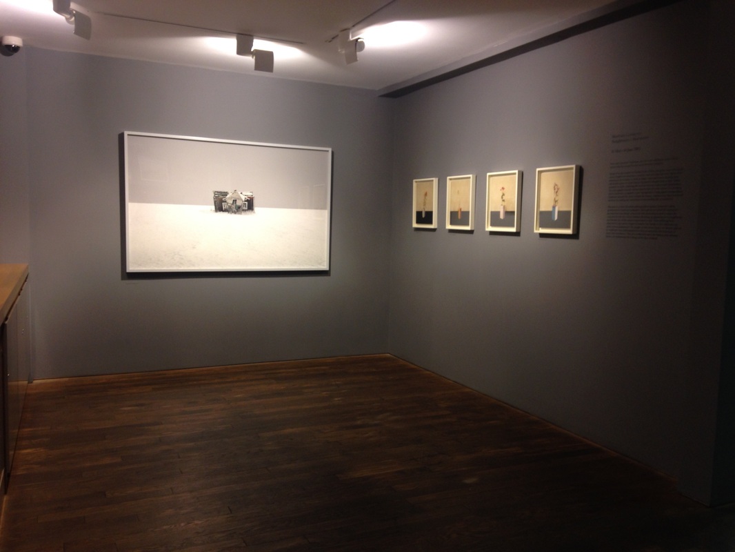
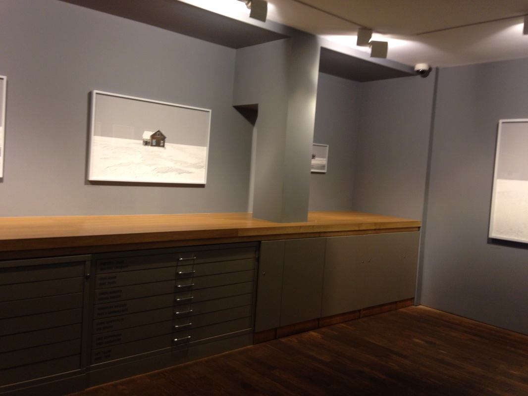
Photographers Gallery
|
The Photographers' Gallery is the largest public gallery in London dedicated to photography. From the latest emerging talent, to historical archives and established artists, we're the place to see photography in all its forms.
The exhibition which I visited at the photographers gallery had the works of Martina Lindqvist in her collections: "Neighbours" and "Murmurs". I was intrigued by the Neighbours exhibition as I feel as though it related to my work slightly. Due to the lack of colour portrayed in the whole of her images it linked as I want to experiment in the same way. From looking at her work it has inspired me to limit using colours in only certain areas of my work, causing the perceptions of others and colour to be expressed greatly when viewers see the work. |
|
|
|
Tom Mills - photographer for final piece
Tom Mills is 35 years old and has traveled extensively around the globe spending time in Africa, the Middle East, India and Europe, living for some time in Denmark and Iceland.
Photography has played a substantial part of his life, and computer skills generated along side it have allowed him to develop an expertise in the emerging field of 360 degree panoramic photography and virtual tour programming.
He is an international panoramic photography award winner, and has been exhibited in England, USA, Germany and France. His photographs have been selected for exhibition in London by the Association of Photographers.
Founded by Tom Mills in 2005, the company has, over the years, garnered a host of prestigious clients from multi national oil companies to world renowned art galleries.
Commissions include the Royal Wedding, where his “balcony kiss” panorama was seen world wide, Cannes Film Festival, the Monaco Royal Wedding, the Champions League Cup Final, Wimbledon, Twilight film premiere, Range Rover Evoque, FA England international, Juventus FC, Arsenal FC and Red Bull. He has created virtual tours of the interior of Prince William’s helicopter and more recently a groundbreaking virtual tour for the National Gallery. His stunning gigapixel panoramas with Facebook recognition have witnessed concerts by the Kings of Leon, Jean Michel Jarre and The Eagles and sporting events at Wembley (England International), Arsenal stadium and Juventus stadium.
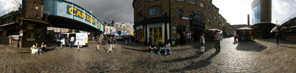
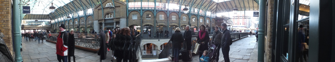
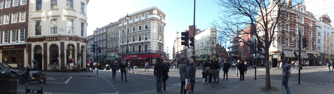
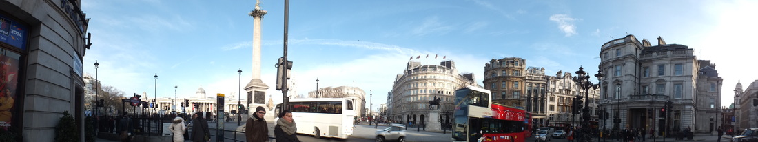
My panoramic photos for final piece:
My final piece idea:
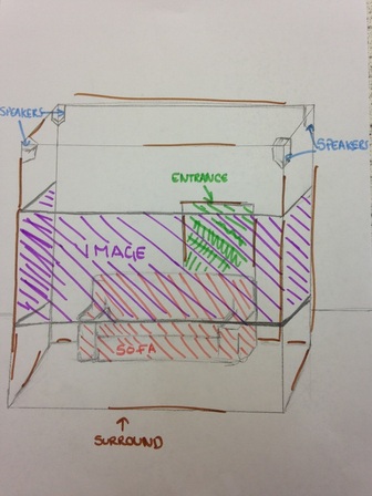
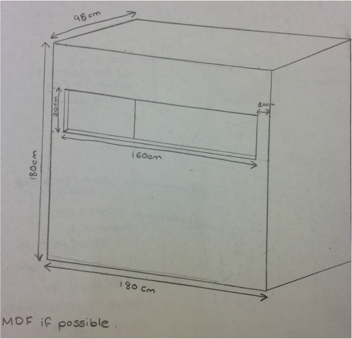
this is my first draft of what i wanted my final piece to look like however, I feel as though the installation is too much and I do not have to space to do such a large installation to have a sofa inside.
Development
|
|
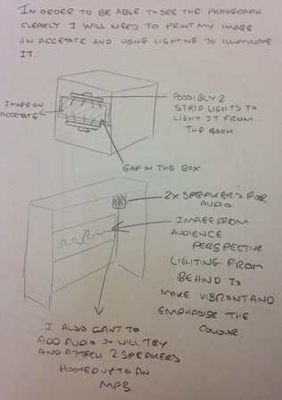
From seeing that my first draft wasn't the best idea I changed it so that the installation would be smaller, however, still have the speakers and the image on the inside of the box and also to create an even greater experience with the image I am going to attach LED strip lights to the frame of where the image is going to be placed and have different colours synced to change. To help achieve the best effect I am going to paint the box a black/navy colour and drape a black sheet over the top so that when the viewer is inside the installation the only light is coming from the photograph
Model
Front View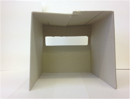
Side View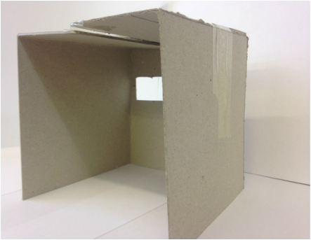
|
Side View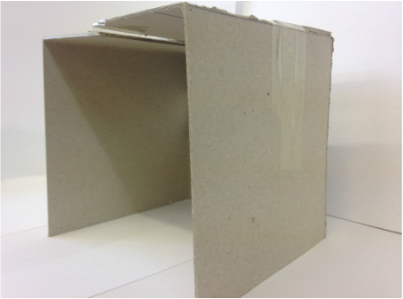
Back View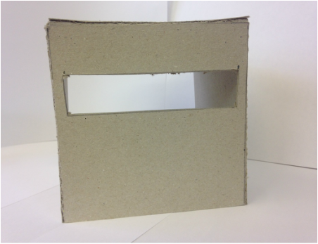
|
sound for my final piece instillation - noises of the city i recorded
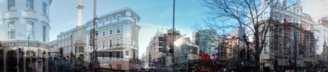
FINAL PIECE IMAGE - multiple layers on photoshop
my final piece instillation
Evaluation
The theme of this project was ‘Colour’. The way in which I then went on to develop my ideas on the topic of colour was that I started to look at links between colour and emotions and the way in which people perceive it. Not only was I just looking at how peoples perspectives change with colour, I decided to look at how the lack of colour in landscapes can change people’s perspectives. Throughout the project it developed so that I was looking at mostly coloured and monochrome photos of landscapes in which I looked at traditional photographers such as, Ansel Adams and Horst Hamman who are both black and white photographers and Allen Klosowski who doesn’t do monochrome photographs but edits them to make them look like they have a washed out look.
However, I have further developed so that I am linking my project to most of the senses with referencing to the synesthesia, which developed from looking at the more experimental photographers such as, Christophe Jacrot and Stephanie Jung, whose works both in some way is distorted in which links to my first sense sight. For instance in Jacrot’s work he manipulates the use of our sight by taking photographs throughout windows after it has been raining, and focusing on the raindrops instead of the landscape outside. By doing this all the viewer can see is a blurred image of the landscape outside. Furthermore the way in which Stephanie Jung changes the viewers perception of the landscape image is by taking multiple images of the same place but slightly moving the camera so one photo hasn’t been taken in the same place, then with the use of Photoshop she layers the images on top of each other whilst changing the opacity of each image so that they become slightly transparent. By doing this she is able to make the image look as though there is movement within the image.
My skills with Photoshop especially have developed greatly through this projected as I have learnt and experimented with changing the opacity of an image and layering, also with referencing with the Christophe Jacrot enlargements I developed my Photoshop skills by learning how to add a rain like effect onto my image so that it would look like it was raining.
Aspects of my studies in which I wish I had explored further is the effect imagery (whether it being to do with the colour or the distortion of the image) can have on people and the how they feel.
